Using text over-bright images can cause problems with readability. We can employ CSS techniques that may help you find the right solution to create visually stunning sections with clear-to-read text background overlays. Some of the popular solutions are adding a gradient overlay, tinting the background image or adding text shadows to bring out the text against the backdrop, and many others.
In this article, we will focus on using gradient overlays when designing a component that has text above an image with the final result being that the text is easy to read.
An Introduction to CSS Gradients
CSS gradients are a special type of CSS image datatype that is made up of smooth and progressive transition between two colors or more (at the minimum a start and an end color). The gradient method relies on the natural contrast of an image while providing a darkening tint through the use of linear, circular, or elliptical gradient properties
The two types of CSS functions to achieve gradient effects in CSS are linear and radial gradient
1. Linear gradient
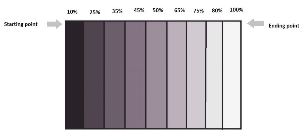
A linear gradient is defined by an X-axis, the gradient line, and two or more color-stop points. Each point on the axis is a distinct color to create a smooth gradient, the linear-gradient function draws a series of colored lines perpendicular to the gradient line, each one matching the color of the point where it intersects the gradient line.
Linear gradient creates an image consisting of a progressive transition between two or more colors along a straight line. Minimum two-color required to create a linear gradient. More than two color elements can be possible in linear gradients. The starting point and the direction are needed for the gradient effect. Linear gradient includes smooth color transitions to going up, down, left, right, and diagonally.
Syntax :
background-image: linear-gradient(direction, color-stop1, color-stop2, …);
The first point is the location on a gradient line where color begins. The second is the ending point. These points are intersected at the gradient line which is perpendicular to the line passing from the box corner which is in the same quadrant. If you want to add more color-stop points on the gradient line, just create a highly customized transition between multiple colors.
A color stop position can be defined by using either length or percentage (%). If no location is specified for your color, by default it is placed halfway between the one that precedes it and the one that follows it.
By default, colors transition smoothly from the color at one stop to a neighboring hue. The midpoint between these two points will be halfway through that specific transition region
1.1. Applying linear gradient with div elements
Generally, the linear gradient CSS function is the most common solution for making the text on a bright image much clearer. Here we will look into detail with the following examples.
Example: Text over the bright image without using a linear gradient for the div element
Here is an example of an image, where the text is not readable to clear.
<div class="container">
   <h1>Welcome to the sample text</h1>
</div>
.container{
width: 100%;
height: 500px;
padding:50px;
color:#fff;
text-align:left;
background-size:cover;
background-image:
url('https://hips.hearstapps.com/hmgprod.s3.amazonaws.com/images/neustadt- 431538673469.jpg?crop=1.00xw:0.753xh;0,0.0220xh&resize=1200:*');
}
See the Pen
Without applying linear gradient over the bright image by Dinesh (@coder_dinesh)
on CodePen.0
Example: Text over the bright image using a linear gradient for the div element
To make this better, we can apply the linear gradient CSS function to the div element (container). That way, the linear gradient will appear more natural, and you won’t find it hard to read. Using text over a bright background image can’t be only horizontal, we can also use them as a vertical gradient.
<div class="container">
   <h1>Welcome to the sample text</h1>
</div>
.container {
width: 100%;
height: 500px;
padding: 50px;
color: #fff;
text-align: left;
background-image:
linear-gradient(to right,rgba(0, 0, 0, 0.7) 0%, rgba(0, 0, 0, 0.6) 10%, rgba(0, 0, 0, 0.5) 19%, rgba(0, 0, 0, 0.35) 31%, rgba(0, 0, 0, 0.2) 38%, rgba(0, 0, 0, 0.1) 54%, rgba(0, 0, 0, 0.05) 70%, rgba(0, 0, 0, 0) 100%), url("https://hips.hearstapps.com/hmg-prod.s3.amazonaws.com/images/neustadt-43-1538673469.jpg?crop=1.00xw:0.753xh;0,0.0220xh&resize=1200:*");
}
With linear-gradient, we will see clearly how it is applied for the above example. Already we have seen the linear gradient direction X and Y-axis. So here I have mentioned for X-axis the keyword is to the right. (i.e) left to the right. Generally, linear gradients consist of a progressive transition between two or more colors along a straight line. Here the text background linear gradient mentions transition between 8 rgba color-stop positions can be defined by percentage(%) with transition opacity.
The color stop positions start with 0% and the endpoint is 100% to the horizontal direction. The starting point 0% has rgba(0,0,0,0.60) with opacity and the endpoint has rgba(0,0,0,0.00) . The color hints 0% to 100% color transitions from black to white, the midpoint of the transition is at 31% to 54% color-changing positions.
See the Pen
Applying with linear gradient over the bright image to the div element by Dinesh (@coder_dinesh)
on CodePen.0
1.2. Applying linear gradient with CSS Gradients Pseudo-elements
Here the div element(banner_text) is positioned absolutely, and it has a linear gradient as a background. We make the linear gradient overlay slightly transparent utilizing the opacity property for each color and also the linear gradient applied to the horizontal direction(to right). This method is also more clear to readable to the text over the bright background image.
<div class="container">
  <div class="banner_text">
    <h1>welcome to the sample</h1>
  </div>
</div>
.banner_text{
width:100%;
height:100vh;
position:absolute;
background-image:
url('https://hips.hearstapps.com/hmg-prod.s3.amazonaws.com/images/neustadt-43-1538673469.jpg?crop=1.00xw:0.753xh;0,0.0220xh&resize=1200:*');
}
.banner_text h1{
color:#fff;
font-size:30px;
z-index:999;
position:relative;
padding:50px;
}
.banner_text::before{
content: "";
position:absolute;
width: 40%;
height: 100%;
color:#fff;
background:
linear-gradient(to right, rgba(0, 0, 0, 0.25) 0%, rgba(0, 0, 0, 0.31) 6%, rgba(0, 0, 0, 0.4) 19%, rgba(0, 0, 0, 0.43) 31%, rgba(0, 0, 0, 0.43) 38%, rgba(0, 0, 0, 0.34) 54%, rgba(0, 0, 0, 0.06) 88%, rgba(0, 0, 0, 0) 100%);
}
See the Pen
Applying linear gradient for Pseudo-elements with div elements by Dinesh (@coder_dinesh)
on CodePen.0
2. Radial gradient
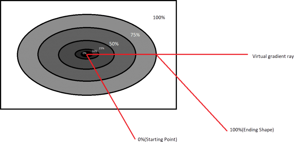
The radial gradient CSS function is different from a linear gradient function. Radial gradients start at a single point and move outward. The radial gradient is defined by a center point, an ending shape, and two or more color-stop points. If you want to create a radial gradient you should define at least two color stops.
The default gradient will be an elliptical shape, the size will be the farthest corner the first color starts at the center position of the element and then fades to the end color towards the edge of Fades happens at an equal rate until you specified the percentage.
If you want to create a smooth radial gradient for horizontal or vertical you can utilize the radial gradient CSS function. Also, the radial gradient CSS function draws a series of concentric shapes radiating out from the center to the ending shape. The ending shape may be a circle or ellipse
Syntax :
background-image: radial-gradient(shape size at position, start-color, …, last-color);
2.1 Before applying radial gradients
In the following example, I have not used the radial gradient for the text background color over the bright background image. So the text is hard to read whenever using the bright background image.
<div class="container">
   <div class="content">
     <h1>Welcome to the sample text</h1>
   </div>
</div>
.container{
width:100%;
height:100vh;
background-size:cover;
background-image:
url('https://hips.hearstapps.com/hmg-prod.s3.amazonaws.com/images/neustadt-43-1538673469.jpg?crop=1.00xw:0.753xh;0,0.0220xh&resize=1200:*');
}
.content{
position:absolute;
width: 50%;
height: 100%;
}
.content h1{
color:#fff;
display:flex;
align-items:center;
justify-content:center;
width: 100%;
height: 250px;
padding:10px;
position:relative;
top:25%;
}
See the Pen
Without applying radial gradient by Dinesh (@coder_dinesh)
on CodePen.0
2.2 After applying radial gradient with ellipse
Here is an example of using the radial gradient with an ellipse shape for the text background over the bright background image. So the text is very clear to read.
<div class="container">
  <div class="content">
    <h1>Welcome to the sample text</h1>
  </div>
</div>
.container{
width:100%;
height:100vh;
background-image:
url('https://hips.hearstapps.com/hmg-prod.s3.amazonaws.com/images/neustadt-43-1538673469.jpg?crop=1.00xw:0.753xh;0,0.0220xh&resize=1200:*');
}
.content{
position:absolute;
width: 50%;
height: 100%;
}
.content h1{
color:#fff;
display:flex;
align-items:center;
justify-content:center;
width: 100%;
height: 250px;
padding:10px;
position:relative;
top:25%;
background:
radial-gradient(ellipse at center,rgba(0, 0, 0, 0.60) 0%, rgba(0, 0, 0, 0.50) 10%, rgba(0, 0, 0, 0.40) 19%, rgba(0, 0, 0, 0.25) 30%, rgba(0, 0, 0, 0.15) 38%, rgba(0, 0, 0, 0.05) 54%, rgba(0, 0, 0, 0.00) 70%, rgba(0, 0, 0, 0.00) 100%);
}
We will see in detail how the radial gradient is applied for the above example. Generally, the radial gradient is defined by the center, ending shape, and color stops.
I have a simple radial gradient made up of black color and specifying various color stops, opacity, sizes, and ending shapes.
When you specified more than two colors, they are distributed along the gradient ray such that the starting point at 0% is dark black rgba(0,0,0,0.68) in our example, the 10% point along the gradient line is the same black rgba(0,0,0,0.50) with opacity, and the 100% point (ending point) is black color with 0 opacity rgba(0,0,0,0.00).
The points lying between 10% and 38% are the intermediate colors you pass through when you’re moving from dark black to light black. Similarly, the points between the 38% color stop and the 100% position, are the intermediate colors between transparent black.
I have specified 8 color-stop points with opacity, the 0% color stop is the first color, and the 10% color stop is the second, the 19% stop is the third color and so on and finally the 100% is the 8th color.
See the Pen
Applying with radial gradient on ellipse by Dinesh (@coder_dinesh)
on CodePen.0
Conclusion
The CSS linear and radial gradient function provides a flexible solution to generate smooth transitions between more than two colors. Before achieving this effect we had to use images. The elements with linear gradients can be scaled horizontal or vertical to any axis without losing the quality. Also with the radial gradient, we can use any shape to apply the colors to the element. Inner side center point to the outer side highest point color becomes faded.
To know more about CSS, Angular, Elementor, and other design-related kinds of stuff visit our Blog.
