Introduction
Monday through Thursday is typically when people work their regular hours. Friday is often seen as a day to wind down and prepare for the weekend. This article discusses expresses a typical dev work week as we transition from Monday to Friday using CSS animations.
Animations in CSS
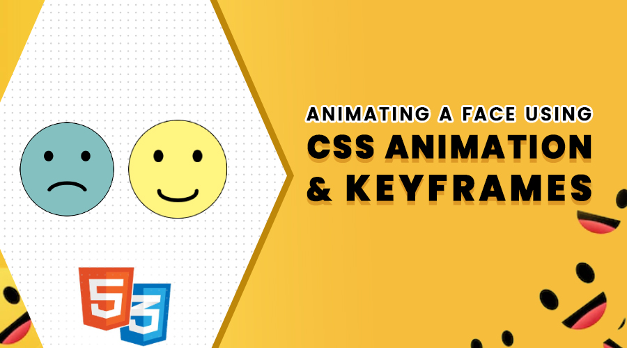
CSS animation is a way to animate the display of elements in the browser. Animations are created by specifying a set of keyframes and then calling the animation on an element. The animation will play between the first and last keyframe, making the element appear to move from one to the other. In this article, we will show you how to animate a face by changing a frown 🙁 into a smile 🙂
Concepts
Step 1: Creating the face
First, I’ll create a div and give it a class name of “face”. Since this div will be the face.
<div class="face"></div>CSS for Face
.face {
  position: relative;
  margin: 50px 0;
  top: 23%;
  left: 50%;
  transform: translate(-50%);
  width: 350px;
  height: 350px;
  background-color: rgba(0, 128, 128, 0.5);
  border-radius: 50%;
  border: 3px solid #000;
  box-shadow: 0px 5px 15px 0px #3e3e3e;
}
Step 2: Creating the Eyes
I’ll create a div and give it a class name of “eyes”. Both eyes would be in the same section because It’s easier to move them around with some pseudo-elements.
<div class="face">
  <div class="eyes">
  </div>
</div>
CSS for Eyes
.eyes:before,
.eyes:after {
  content: "";
  position: absolute;
  top: 30%;
  width: 35px;
  height: 35px;
  border-radius: 50%;
  background: #000;
  transition: 0.5s;
}
.eyes:before {
  left: 25%;
}
.eyes:after {
  right: 25%;
}
Step 3: Creating the Mouth
We need to create the mouth on the face so I’ll create a div inside our previous div which is the face. For the mouth, I’m using SVG to animate frowny to smiley I’ll show you this in @keyrame animation section.
<div class="face">
      <div class="eyes">
        <div class="mouth">
          <svg viewBox="0 0 10 10" class="svg-4">
            <path d="M2,5 C3,3.5 7,3.5 8,5" />
          </svg>
        </div>
      </div>
    </div>
CSS for Mouth
svg path {
  fill: none;
  stroke: #000;
  stroke-linecap: round;
  stroke-width: 0.6;
}
.mouth {
  position: absolute;
  height: 150px;
  width: 225px;
  transition: 0.5s;
  top: 40%;
  left: 18%;
  /* transform: translateX(0%); */
}
So much for the frowny face. Now let’s turn that frown into a smile with animations.
Animation Using Keyframes
We have to create keyframes for moving the eyes, the mouth, and the face background color. We will discuss this further in the coming section.
Keyframes
CSS keyframes are used to create animation effects in CSS. They allow you to create animation effects between two points in time, and to specify the properties that will change during the animation. With @keyframes rule. you can specify the name of the animation, and then a set of keyframes that define the different states of the animation.
Here’s the @ rule we’ll be using:
@keyframes eyes {
 	/* rule sets here … */
}
The word eyes is an identifier of our choosing that we’ll use to refer to this animation.
Keyframes for Eyes:
The keyframe selectors are 0%, 50%, 75%, and 100%. The below code example represents a different height of the animated element. PS: the order of the keyframes doesn’t really matter as it will play in the order specified by the percentage.
@keyframes eyes {
  0%,
  50% {
    height: 35px;
  }
  75%,
  100% {
    height: 45px;
  }
}
Keyframes for Mouth:
I’ve set four keyframes. I’ve created paths for each keyframe in the mouth animation. The frown starts at 0% with the smiley at 100%. You can use some SVG editors to get accurate paths.
@keyframes mouth {
  0% {
    d: path("M2,5 C3,3.5 7,3.5 8,5"); /* frowny mouth */
  }

  50% {
    d: path("M2,5 C2,5 8,5 8,5"); /* frowny to flat  */
  }
  75% {
    d: path("M2,5 C2,6 8,6 8,5"); /* frowny to slight smiley */
  }

  100% {
    d: path("M2,5 C2,7 8,7 8,5"); /* frowny to smiley */
  }
}
Keyframes for Face Background:
For the face, I added four keyframes for changing the background color to match the frowny face to smiley here’s the code. This same animation will apply for weekdays navbg also.
@keyframes facebg {
  0% {
    background-color: rgba(0, 128, 128, 0.2);
  }
  50% {
    background-color: rgba(0, 128, 128, 0.5);
  }
  75% {
    background-color: rgba(255, 240, 0, 0.5);
  }
  100% {
    background-color: rgba(255, 240, 0, 0.7);
  }
}
Animation properties that I used
Next, I’ll add some animation types that associate with the animation name ie: facebg.
.face{
animation-name: facebg;
animation-duration: 10s;
animation-iteration-count: infinite;
}
Animation Name
The animation-name CSS property specifies the names of one or more @keyframes rules describing the animation or animations to apply to the element.
Animation Duration
The animation-duration CSS property sets the length of time that animation takes to complete one cycle.
Animation Delay
The animation-delay CSS property specifies the amount of time to wait from applying the animation to an element before beginning to perform the animation.
Animation Iteration Count
The animation-iteration-count CSS property sets the number of times an animation sequence should be played before stopping (in this example I used infinite it will repeat forever ).
Animating the Weekdays
Next, we will see how to animate the weekdays to match with the frowny to smiley for this first, you have to create a horizontal box that will contain the days of the week. I’ll create this with Flexbox.
Flexbox is a layout mode used in CSS that allows you to easily create complex responsive layouts. With flexbox, you can easily create grid-like layouts where the columns and rows are evenly spaced and the items within them are automatically sized to fit.
Create a basic List item and give it a class name of “nav”.
<div class="weekdays">
    <ul class="nav">
      <li><span class="day1">Monday</span></li>
      <li><span class="day2">Tuesday</span></li>
      <li><span class="day3">Wednesday</span></li>
      <li><span class="day4">Thursday</span></li>
      <li><span class="day5">Friday</span></li>
    </ul>
  </div>
CSS for nav
.nav {
  display: flex;
  justify-content: space-around;
  border: 1px solid #000;
  padding: 10px 20px;
  border-radius: 5px;
  color: #000;
  font-size: 24px;
  font-weight: 600;
}
In the above code example, a nav has been set to display: flex, which means that the 5 list items become flex items. The value of justify-content has been set to space-between in order to space the items out evenly on the main axis. An equal amount of space is placed between each item on the left and right. Also, I added a bit of style to the nav.
Next, I’ll add some animation types that we discussed keyframes section.
Keyframes for nav BG:
@keyframes navbg{
  0% {
    background-color: rgba(0, 128, 128, 0.2);
  }

  50% {
    background-color: rgba(0, 128, 128, 0.5);
  }
  75% {
    background-color: rgba(255, 240, 0, 0.5);
  }

  100% {
    background-color: rgba(255, 240, 0, 0.7);
  }
}
Keyframes for Weekdays List:
.weekdays span {
  opacity: 0;

  animation-name: days;
  animation-duration: 10s;
  animation-iteration-count: infinite;
}
.weekdays .day1 {
  animation-delay: 0s;
}
.weekdays .day2 {
  animation-delay: 2s;
}
.weekdays .day3 {
  animation-delay: 4s;
}
.weekdays .day4 {
  animation-delay: 6s;
}
.weekdays .day5 {
  animation-delay: 8s;
}

@keyframes days {
  0% {
    opacity: 1;
  }
}
If you notice above I used animation-delay for this particular element for different days because this will cause the animation to start 2 seconds after the element is loaded.
See the Pen
Frown to Smile by Babu (@babupro)
on CodePen.0
Conclusion
By setting keyframes, you can control the timing and movement of your animation. In conclusion, keyframe animation is a great way to create fluid and engaging animations in your web projects. By understanding the basics of how it works, you can create animations that are sure to impress your viewers.