Introduction
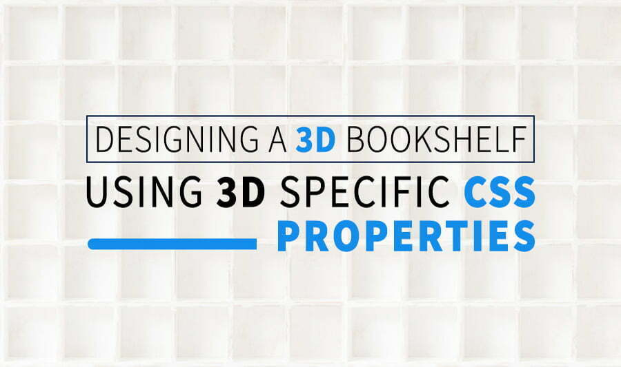
In this article, I will be explaining how to Design a 3d cubby hole or bookshelves using CSS. Before I start I want to note I have used Codepen to demonstrate this.
CSS Properties
In this post, we will learn about 3D CSS properties and layout patterns useful for cascading style sheets and transforming two-dimensional to three-dimensional space.
With the power of CSS transforms, you can do wonders on your website. Not only will it help with animations and 3D effects for more appealing designs but also provide easier ways to implement them on your website!
To explain the CSS transforms and their properties I have created a simple 3D cubby hole in CSS, using the perspective attribute to enhance the 3d and then set about creating a WebGL equivalent.
CSS Transform Properties We will be using
Two main properties are used to define CSS transforms: transform and transform-origin
Transform
Specifies the transform that should be applied to an element. It is a space-separated list of composite transforms, which are applied one after another as requested by the composition operation. Composite transforms are actually used in order from right to left.
Syntax :
transform : none | transform-functions | initial | inherit;
Transform-origin
The anchor point is the location at which an element’s transforms are calculated. This can be used for rotations, scaling, or skewing and will always need a specific spot as their parameters depend on it!
Syntax :
transform-origin : x-axis y-axis z-axis | initial | inherit;
Transform-style
With the transform-style property, you can specify how nested elements are rendered in 3D space. This property must be used together with the transform property.
Syntax
transform-style : flat | preserve-3d | initial | inherit;
Rotating
As the term implies, Rotate works by rotating the element along with one of three axes, given a degree.
Various CSS transform methods used:
With these CSS transform properties you can use the following 3D transformation methods:
- rotateX()
- rotateY()
- rotateZ()
In CSS Transform effects in 3D include the Z-axis. X is the width, Y is the height, and Z gives the depth of the screen. CSS transforms are a great way to modify the appearance, size, or position of an element without disrupting normal document flow.
CSS transforms are powerful CSS properties that let you apply affine linear transformations to HTML elements. These include rotation, skewing, and scaling both in the plane as well as in 3D space!
3D specific CSS properties
3D CSS transformations are a bit more complex than 2D CSS. You have to start by configuring the 3rd dimension, then decide on how your elements will behave in that space, and finally, put it all together!
Perspective
To move the element in the z-axis CSS perspective property should be used then only you will be able to visualize changes in Z-axis by setting the right perspective value.
The perspective property defines how far the object is away from the user. So, a lower value will result in a more intensive 3D effect than a higher value. (Source — W3 Schools)
Syntax
perspective: length | none;
Perspective-origin
The perspective-origin property defines the position of the user looking at the 3D element.
When defining the perspective-origin property for an element, it is important to remember that CHILD elements will get this effect and not their actual elements.
Syntax
perspective-origin : x-axis y-axis | initial | inherit;
Building the 3d Bookshelf
Starting with 2D
First, let’s start with a 2D Bookshelf design, and later on, we will see how to convert it to 3D using advanced 3D-specific CSS properties. Start with the 3d bookshelf sides! A 3D bookshelves have five faces — bottom, back and left, right,& top.
CSS 2D Transformations include these basic operations – translation, rotation, and scaling. But here in this case we are going to use only translation and rotation. The transformations are directed around three axes:
- The x-axis runs left-to-right.
- The y-axis runs straight bottom-to-top.
- The z-axis project from the screen.
The foremost is translation. Use translateX, translateY, and translateZ, to move an object everywhere in three dimensions. The next is rotation, to use it in one or more axes, use rotateX, rotateY, and rotateZ. Below is the HTML element for the box we are going to work on.
<div class="main-box">
  <div class="sub-box">
    <div class="side front"></div>
    <div class="side back"></div>
    <div class="side right"></div>
    <div class="side left"></div>
    <div class="side top"></div>
    <div class="side bottom"></div>
  </div>
</div>
In the below CSS code you can see that we have used translate and rotate properties of the transform.
For the back face, we have given transform:rotateY(180deg) translateZ(40px);
For right face, transform:rotateY(90deg) translateZ(50px);
For left face, transform: rotateY(-90deg) translateZ(50px);
For top face, transform:rotateX(-90deg) translateZ(50px);
For bottom face, transform:rotateX(90deg) translateZ(50px);

body{
  max-width: 100%;
  overflow-x: hidden;
}
.main-box {
  width: 100px;
  height: 100px;
  float: left;
}
.sub-box {
  width: 100%;
  height: 100%;
}
.side {
  display: block;
  position: absolute;
  width: 100px;
  height: 100px;
}
.back {
  transform:rotateY(180deg);
  background:url("image-path(or)image-url") center/cover;
  background-repeat: no-repeat;
}
.right {
  transform:rotateY(90deg);
  background: url("image-path(or)image-url") center/cover;
  background-repeat: no-repeat;
}
.left {
  transform: rotateY(-90deg);
  background:url("image-path(or)image-url") center/cover;
  background-repeat: no-repeat;
}
.top {
  transform:rotateX(-90deg);
  background:url("image-path(or)image-url") center/cover;
  background-repeat: no-repeat;
}
.bottom {
  transform:rotateX(90deg);
  background:url("image-path(or)image-url") center/cover;
  background-repeat: no-repeat;
}
Below is the 2D output for the following CSS code:


In 2D we cannot see the top, bottom, left, right faces because we haven’t used the 3D CSS properties. To see those faces let’s use the 3D properties and we will see how the shapes are altered.
See the Pen
Design of 3d cubby hole or shelves using CSS by Dinesh (@coder_dinesh)
on CodePen.0
Lets get that 3D look
To convert the 2D bookshelves to 3D we are going to use the perspective property which belongs to the 3D Transforms of CSS. Here you can see we have given, perspective: 700px; & transform-style: preserve-3d;
This means it indicates to the browser that the child elements should also be positioned with respect to the 3D space. A lower value of perspective results in more intensified 3D effects, and a higher perspective value results in less intensified 3D effects.
The perspective-origin configures the camera angle of the element. Specifically, this property establishes fading point’s location in the screen. For example you can set the point to the left or right as if the viewer is to the left or right.
Likewise you can set it top or bottom as if the viewer is at higher or lower standpoint. Here we have given perspective-origin:30% 10%; i.e 30% from left to right and 10% is bottom to top.
.main-box {
  width: 100px;
  height: 100px;
  float: left;
  border: 8px solid #926a45;
}

.sub-box {
  width: 100%;
  height: 100%;
  transform-style: preserve-3d;
  perspective: 700px;
  perspective-origin:30% 10%;
}
Below is the 3D output for the following CSS code.

See the Pen
Design of 3d Book shelves using CSS by Dinesh (@coder_dinesh)
on CodePen.0
Likewise here I have shown some examples for various perspective & perspective origin values and how these values impact the 3D effect.


Conclusion
In this article, we have covered some of the basic 3D-specific CSS Transforms properties. Particularly, using transformations and perspectives of CSS to build a 3D bookshelf. You can make use of these CSS’s roles, further along, for leveraging the user’s acquaintance with existing 3D interfaces, such as a card, box, or dial.
To know more about CSS, Angular, Elementor, and other design-related kinds of stuff visit our Blog.